¶ Basic Information
Note: This documentation was built using the latest available
4.7.0/Master
branch as posted to Master 47 Demo
Site on 2017-01-10.
The Clarity Ecommerce Administration Dashboard provides access to
manage the Store, including Accounts, Sales and
Products. It is generally located at your
/Admin/Clarity-Ecommerce-Admin page. The site itself is a Single Page
Application (SPA), meaning that once the page is loaded in the
browser, only content replacements occur as you navigate the SPA and not
a full page reload. The URL in the Address Bar of the Browser should
update as needed when changing "page" and content views. In most cases,
the URL as updated in the Address Bar can be loaded in a new window or
via browser page refresh. There are some exceptions where you may be on
a different tab in the loaded page or redirected to the Admin Home page.
All content within the Admin SPA requires the user to be authenticated
with the CEF Server. Users that have not authenticated will be
redirected to a Login form within the SPA where they may enter their
Username and Password to sign in. If the user does not have an
Administrative role within CEF, their current role may not have the
necessary permissions to see some or much of the SPA. Areas within the
SPA that the user does not have permission to see are excluded from the
HTML of the page (not simply hidden) using Angular ng-if statements and
other security measures. Note that it may still be possible for a
malicious user to access data via brute force attacks or other measures,
there is no guarantee in any software to be 100% safe from attacks or
intrusions.
Please note that imagery in this article may become out of date during
version releases.
¶ The Header Bar
On all pages of the Admin SPA, the Header Bar is available for use and
provides quick access to most of the views within the SPA. Note that if
the user is not authenticated to the Server, a Login button replaces the
standard menu drop-down button.
+------------------------------------------------------------------------------------------------------------------------------------------------------------------+
| |
|
| |
|The Header Bar when the user is not authenticated. The light gray around the DNN button is the standard mouse hover color to give visual feedback to the user.|
+------------------------------------------------------------------------------------------------------------------------------------------------------------------+
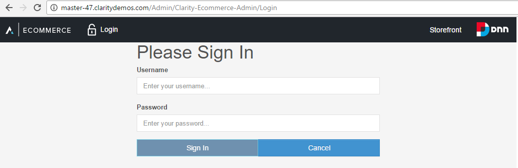
¶ Login
In the Admin SPA, if the user is not authenticated to the server, they
will automatically be redirected to the Login page to authenticate.
+-------------------------------------------------------------+
| |
|
| |
|The Login Page |
+-------------------------------------------------------------+
The Sign In button is disabled until both the Username and Password
fields are filled in. If one field is filled in but the other is not,
the field will enter an Invalid state and the label will turn red as
will the border of the field. Once the form has been "touched" (content
entered into either field), if either or both field(s) have been
cleared, both fields will show the Invalid state.
With both fields filled in, the Sign In button will become enabled,
allowing the user to click it. Clicking the button will initiate an
authentication attempt with the server using standard ServiceStack
mechanisms which have been enabled by a custom ASP.NET Identity provider
Clarity has created to enable Identity in ServiceStack.
Additional authentication methods can be enabled via the use of Plugins,
please consult with Clarity regarding additional and custom
authentication methods such as Sign In with Facebook or Two-Factor
authentication.
The Cancel button will send the user to the website root (the site home
page).
+-----------------------------------------------------------------------------------------------------------------------------------------------------+
| |
|
| |
|The Header Bar when the user is authenticated. The user is now presented with the menu drop-down and a welcome statement with their Display Name.|
+-----------------------------------------------------------------------------------------------------------------------------------------------------+
When activated, the menu expands from the top over any current view
content. This is a Mega Menu, meaning that it covers the width of the
page and provides a large amount of content as opposed to a traditional
menu with sub-menus as seen in most desktop software. Mega-menus provide
easy access to a larger amount of content without having to search
through individual smaller menus and are becoming more and more common
on websites today. They are also preferable to traditional menus when
working in mobile environments such as tablets and phones as you only
need to open the menu once to see the information instead of opening a
menu and sub-menu at a time.
Clicking a menu link will load the appropriate view and collapse the
menu.
+----------------------------------------------------------------------------------------------------------------------------------------------------------------------------------------------------------------------------------------------------------------------------------------------------------------------------------------------------------------------------------------------------+
|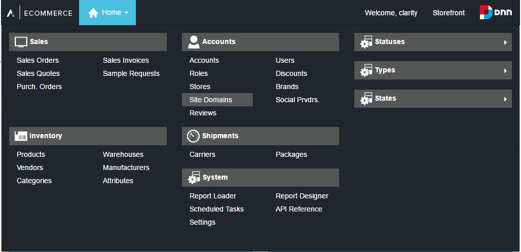 |
|
| |
|The Header Bar when the menu is activated. Multiple primary view areas are grouped together under headers, with their views underneath. The third column contains infrequently used areas that require an additional click/tap to expand in an accordion-style container. The active page will have a light blue background while links that are hovered over will have a light gray background.|
+----------------------------------------------------------------------------------------------------------------------------------------------------------------------------------------------------------------------------------------------------------------------------------------------------------------------------------------------------------------------------------------------------+
+-------------------------------------------------------------------------------------------------------------------------------------------------------------------------------------+
|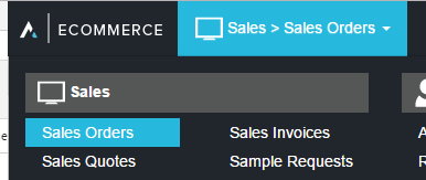 |
|
| |
|The Header Bar with an active menu after navigating to a view other than home. Note the change in the drop-down title as well as the color change on the link to the loaded view.|
+-------------------------------------------------------------------------------------------------------------------------------------------------------------------------------------+
¶ Sales
The Sales Area within the Admin SPA includes Sales Orders, Invoices,
Quotes, Sample Requests, and Purchase Orders. This is where most store
employees would be expected to work to manage anything related to these
areas.
¶ Sales Orders
The Sales Orders view contains a filterable grid of Sales Order records,
grouped by their status.
¶ Filters
The filters include:
- Type: Web, Phone, On-Site and custom types
- Status: Pending, Confirmed, Backordered, Split, Partial Payment
Received, Full Payment Received, Processing, Shipped from Vendor
(Drop Shipped), Shipped, Completed, Void - #: The CEF identification number for the record
- Key: The external identification key (custom key) for the record
- Email: The email for the billing contact on the record
- Account: The external identification key (custom key) for the
The account assigned to the record (it is possible an order may not have
an account assigned, though usually would have a User in these
cases, often it will have both) - User: The username for the User assigned to the record (it is
possible an order may not have a User assigned, though usually would
have an Account in these cases, often it will have both)
The Filter button will initiate a request to the server for records
matching the filters, having no filters applied will return all sales
records according to the current Paging information. See the bottom of
the grid to select Paging information.
The Reset button will clear the filters so the user may start over or
enter different data more easily.
Filters, as entered, do not save on page reload.
¶ Records Grid
+-------------------------------------------------------------+
|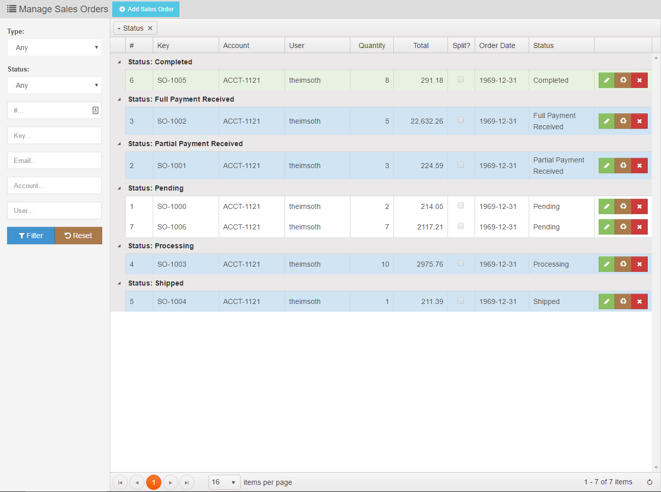 |
|
| |
|The default Sales Orders view |
+-------------------------------------------------------------+
¶ Grouping Records
The Grid itself, in its default view, will group records based on their
Status. The user may remove this grouping, add more groupings, or
otherwise rearrange groupings dynamically.
- Drag a column header to the grouping bar to add a grouping
- Drag a grouping button in the grouping bar above or below another
grouping to change the order of groupings - Drag a grouping button in the grouping bar away from the grouping
bar to remove a grouping. Alternatively, click the x in the grouping
button to remove it. - Click a grouping button to change the sort order of the values in
the group - Grouping changes do not save on page reload
¶ Sorting Records
Users may also perform actions such as changing the Page Size, jumping
between pages, and sorting the records by one or more columns. Click
column headers to sort by that column. Click multiple times to change
the direction and/or remove the sort of that column. Shift-click to sort
by additional columns. Selected column sorts do not save on page reload.
¶ Paging Records
To save on system resources, records are only returned in Pages as
opposed to gathering all records from the system at once. Paging
controls can be used to switch between pages as well as changing the
total number of records returned.
The number of records is usually powers of 2 starting at 8 and going up
to 128. The default number of records is usually 16, allowing the user
to select a smaller 8 as needed. There are some views that go higher,
such as 512 for convenience. The current page is displayed in the bottom
right of grids showing the starting and ending record as it is counted
in the current filtered (or non-filtered if none set) sequence and the
total number of records that could be returned by this query if all were
to be returned.
A refresh button allows just the data to be refreshed from the server
without having to reload the page (which would reset filters, groupings
and sorting settings as selected).
¶ Columns
The default columns are:
- #: The CEF identification number for the record
- Key: The external identification key (custom key) for the record
- Account: The external identification key (custom key) for the
The account assigned to the record (it is possible an order may not have
an account assigned, though usually would have a User in these
cases, often it will have both) - User: The username for the User assigned to the record (it is
possible an order may not have a User assigned, though usually would
have an Account in these cases, often it will have both) - Quantity: The total number of items on the order (10 nails and one
hammer would show a quantity of 11) - Total: The total cost of the order at the time of sale, in USD
(unless another currency has been selected for the order) - Split?: A checkbox demonstrating if the order was split into
multiple orders due to some of the line items being on back order
while others were not - Order Date: a yyyy-MM-dd representation of the date of sale
- Status: The current status of the order
- Commands: The three command buttons for an order. Note that
different user role permissions may show different buttons in the
command area, such as not having rights to Recycle (soft-delete) or
Delete (hard-delete) an order. The standard visible buttons for a
CEF Global Administrator is:- Edit: A green button with a pencil icon. Editing will open the
Detail view of the order - Recycle: A brown button with a Recycle icon. Alternates with
Restore if the record is currently in the recycle bin. The
Recycle Bin allows the order to be removed from most data calls,
especially ones visible to customers without losing track of the
data, and can be recovered by Restoring the record. A warning is
issued to the user when the Delete button is clicked to confirm
if this was the intended action. - Restore: A blue button with a Recycle icon. Alternates with
Recycle if the record is currently not in the recycle bin. A
warning is issued to the user when the Delete button is clicked
to confirm if this was the intended action. - Delete: A red button with an x. Deleting a record is a hard
delete, all data is removed from the database and can only be
recovered via database backups. A warning is issued to the user
when the Delete button is clicked to confirm if this was the
intended action.
- Edit: A green button with a pencil icon. Editing will open the
The default columns may not be rearranged, added to, or removed at this
time.
¶ Rows
Some grids have the ability to color the row based on data such as
Status. In Sales Orders, Completed records show as green, Voided records
show as Red, and so on. All records grids in the Admin SPA are read-only,
that is, information cannot be modified 'on the fly' and saved. Any
changes would require entering the Detail view for that record to modify
it.
¶ Revisions
| Revision # | Date Revised | Revised By | Revision Made |
|---|---|---|---|
| 1 | 05/12/2021 | Jonathan Malott | Updating Images to display within the page |